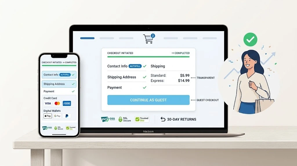
The hardest part of running an online store is not getting people to visit. It is getting them to finish buying something. Most retailers invest heavily in marketing, content, and search visibility to attract clicks. But a completed transaction requires a fundamentally different kind of effort.
Cart abandonment illustrates this problem at scale. Customers browse products, add items to their baskets, reach the checkout, and then leave. The reasons range from genuine distractions to cold feet. Yet a significant and measurable portion of these losses stem from poor checkout design.
The positive side of this equation is that checkout problems are diagnosable and correctable. They follow patterns. The features outlined below target the specific elements that most commonly drive shoppers away before they complete a purchase.
Place the Cart Where Shoppers Expect It
The cart icon is the anchor of the entire shopping experience. If it is difficult to locate or fails to communicate clearly, customers lose confidence in the process.
Standard placement in the top-right corner works because it matches years of accumulated user expectations. When items are added, the display must update instantly — showing the current count and running subtotal without requiring a page refresh.
Opening the cart should feel seamless. A compact dropdown or a panel that slides into view lets shoppers review contents and adjust quantities without navigating away from the page they were browsing. Maintaining that context preserves the momentum toward checkout.
Give Shoppers the Option to Buy Without Registers
Mandatory account creation has become one of the most reliable ways to lose a potential sale. Modern consumers have limited patience for setting up new credentials, particularly when the purchase is straightforward.
Guest checkout deserves the most visible, default position on the login screen. Collecting an email address for transactional messages is practical. Insisting on a username, password, and profile before allowing a purchase is not.
After the transaction closes, there is an appropriate moment to suggest account creation. The customer has already experienced the value of the purchase and may appreciate future convenience. A small incentive for registering can work effectively at that stage, but it should never interfere with the sale itself.
Show All Costs Before the Checkout Begins
Surprise fees at the final step are among the most powerful triggers for cart abandonment. The emotional reaction — a sense of being misled — is immediate and difficult to recover from.
Communicate shipping costs as early as the product page. When shipping is free, make that fact prominent. When charges depend on location, include a postal code calculator in the cart so customers can see an accurate estimate before they start entering their details.
Taxes warrant the same upfront treatment. Hiding them until the confirmation screen creates distrust. A web design company with e-commerce expertise integrates pricing transparency into the browsing and checkout flow from the beginning, treating it as a foundational element rather than an afterthought.
Strip the Checkout Form to What Matters
Every additional field in a checkout form is a small psychological barrier. Even fields that seem trivial — a phone number, a referral question, a newsletter checkbox — contribute to the cumulative sense that the process is too demanding.
Request only what is strictly necessary for order fulfilment: where to ship, how to bill, and the payment method. Everything else can wait for a post-purchase survey or an optional account profile.
Technical refinements reduce the perceived weight of even required fields. Address autocomplete, auto-populating geographic information from a postal code, and dropdown selections all minimise keystrokes. A Singapore web designer familiar with checkout optimisation understands that these small improvements compound, transforming a tedious form into one that takes moments to complete.
Handle Errors Gracefully and Immediately
A form that rejects the customer’s submission after they have filled out every field — without clearly explaining the problem — is a powerful catalyst for abandonment. The frustration of backtracking through an entire form is often enough to make someone leave permanently.
Inline validation prevents this scenario by surfacing issues the moment they occur. A misspelled email address triggers an immediate, clearly worded notification. A blank required field is flagged as the customer tries to advance past it. The messages should be specific, pointing directly to the problem and explaining how to fix it.
Browser autocomplete complements this approach by reducing errors in the first place. When a customer’s saved information populates with a single tap, manual entry — and the mistakes that come with it — drops dramatically. The combination of autocomplete and real-time validation creates a checkout that feels supportive rather than adversarial.
Cater to Different Payment Preferences
Credit cards are no longer the default assumption for every customer. Digital wallets, bank transfers, and deferred payment options have fundamentally changed how people prefer to transact.
Supporting methods like Apple Pay, Google Pay, PayPal, and buy-now-pay-later services such as Klarna or Afterpay acknowledges this diversity. On mobile devices, digital wallets are particularly powerful because they compress the entire payment step into a single authenticated gesture.
Your analytics reveal which methods and devices dominate your audience. If mobile usage is high, wallet integration becomes essential. Removing the friction of typing a full card number on a small touchscreen directly correlates with fewer abandoned sessions and more completed orders.
Communicate Security Through Design
Handing over payment information requires trust. Your checkout page must visually communicate that the transaction is safe, professional, and legitimate.
Security badges, SSL indicators, and payment processor logos should appear directly alongside the payment form. These signals address concerns at the exact moment they are most acute. Guarantee icons reinforce the message that the retailer stands behind its products.
Design consistency across the checkout experience reinforces that trust. If the page’s appearance changes abruptly or the URL redirects to an unfamiliar domain, suspicion takes hold. Maintaining your brand’s visual identity — colours, typography, and layout — throughout the transaction prevents that disruption. A web design company attentive to these details ensures the customer’s confidence is sustained from the first product page to the final confirmation.
Trigger Automated Recovery Emails
No matter how well-designed the checkout, some abandonment is inevitable. External interruptions — a dying phone, an unexpected obligation, a moment of hesitation — fall outside the scope of design.
Automated email sequences that activate when carts are left behind offer a practical mechanism for recapturing lost sales. Most major e-commerce platforms include this tool as a standard feature.
The email should be concise and action-oriented. Display the abandoned product with a clear image and provide a direct link that restores the cart exactly as the customer left it. A modest incentive — free shipping or a small discount — can tip a hesitant buyer toward completion. However, frequent promotional incentives risk conditioning customers to abandon carts intentionally as a strategy for unlocking deals, which undermines the long-term effectiveness of the approach.
Make Return Policies Easy to Find and Understand
Uncertain or opaque return policies create doubt at the most consequential moment in the buying journey. Shoppers who cannot quickly verify that returns are straightforward will often choose not to purchase at all.
Place return information in locations customers naturally encounter: the product page, the cart, and the site footer. Proactive visibility demonstrates confidence in your own terms.
Use language that requires no interpretation. “Free 30-day returns” is immediately understood and reassuring. Dense legal paragraphs are not. When buyers know that returning an item is simple, their willingness to complete a purchase increases meaningfully. This is a detail that a Singapore web designer focused on conversion performance will integrate into the site structure from the outset.
When Specialised Expertise Becomes Essential
Diagnosing and resolving checkout problems demands a combination of skills that rarely exist in a single person: understanding consumer psychology, technical implementation knowledge, and an eye for design consistency.
A qualified professional can audit your entire checkout sequence and identify exactly where customers disengage. They understand how to restructure forms, integrate payment systems, and test the experience across devices. Their perspective extends well beyond cosmetic improvements.
For new stores, engaging a web design company from the project’s earliest stages ensures the checkout is built on a solid technical foundation. Server configuration, security certificates, and payment gateway integration all demand precision from day one. Establishing these correctly early avoids expensive remediation later and allows you to concentrate on serving customers rather than correcting structural problems.
Final Reflections
Complete elimination of cart abandonment is not a realistic objective. Some degree of drop-off is inherent to online commerce, and no design intervention can fully prevent it.
What effective design accomplishes is reducing abandonment to manageable levels. Accessible cart placement, guest checkout, transparent pricing, and streamlined forms address the core friction points. Diversified payment options, visible trust signals, and automated recovery strategies reinforce the broader experience.
Every unnecessary obstacle removed from the checkout path raises your conversion rate. Test your store on a phone, observe where real users hesitate, and address those friction points deliberately. A checkout experience built with precision and care remains the most reliable tool for turning casual browsers into committed buyers.
Comments
No comments yet. Be the first to react!