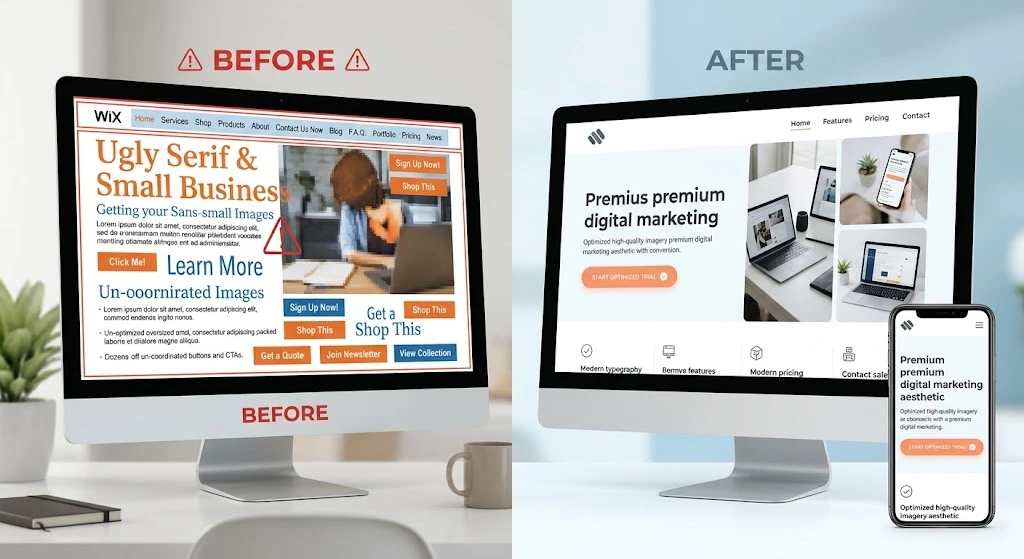
Wix appeals to small business owners because it removes most technical obstacles. The editor is approachable, and a working site can go live within a few days. Over time, though, convenience turns into clutter. Sections accumulate, apps pile up, and the original design intent gets buried. Mobile layouts break, pages slow down, and visitors leave without acting.
Reversing that situation does not demand a big spend. A custom platform and an agency contract are not required. What helps most is a clear process, a willingness to delete, and an understanding of how people actually navigate websites. The steps below explain how to repair an underperforming Wix site while keeping costs manageable.
Step 1: Identify Where Visitors Get Stuck
Diagnosis comes before redesign. Open your site on a phone and walk through it as a stranger would. Try to buy something or submit a contact form. If you can, ask someone unfamiliar with your business to try the same tasks.
Could they read the text without pinching? Were important links hidden in the menu? Did any graphic cover a button? Record every problem you find. Ageing Wix sites usually share three issues: too many competing elements, oversized image files, and a checkout path that confuses people. That list becomes your roadmap.
Step 2: Cut the Excess and Fix the Alignment
Wix lets you position anything anywhere on the canvas. That freedom explains why so many self-built sites look disorganised. Owners often treat the homepage like a printed pamphlet, filling it with company history, staff details, and every service offered.
A conversion-focused page answers three questions within seconds:
- What do you do?
- Who is it for?
- What should the visitor do next?
Remove anything that does not serve those answers. Delete long paragraphs. Switch off autoplay video and scrolling tickers. Use the grid guides to align text and images. Clean alignment builds credibility. A chaotic layout pushes visitors away.
Step 3: Take Charge of the Mobile Editor
Wix keeps desktop and mobile editing separate. Many owners design on a laptop, click the mobile optimisation button, and assume the work is done. That assumption creates real problems. Auto-generated mobile views often overlap text, shrink buttons below tappable size, and crop images poorly.
You must open the mobile editor and adjust each element manually. Make buttons larger. Verify the navigation opens and closes smoothly. Rearrange sections so the vertical flow makes sense. Most of your visitors arrive on phones. A weak mobile experience costs you most of your potential customers.
Step 4: Bring Down Page Weight
Speed directly affects conversions. When a page takes longer than three seconds to load, visitors tend to leave. Wix sites are especially vulnerable as content builds up.
No coding knowledge is needed to improve this. Begin with your images. Huge, high-resolution photos drag performance down. Compress them with a free tool like TinyPNG before uploading. Visible quality stays the same while file sizes drop sharply.
Then assess your apps. Each installed app adds extra code. A chat widget, a popup, a calendar, and a social feed running together will slow your site noticeably. Keep only what you actively use and remove the rest.
Step 5: Make the Next Step Obvious
Decide what your site is for. Perhaps you want bookings, or maybe you sell products directly. Whatever the goal, visitors should recognise it immediately.
Your call-to-action button needs contrast. Choose a colour that stands out from the surrounding design. Place it high on the page so it appears without scrolling. Repeat it lower down for visitors who read the full content.
Forms also need simplifying. Requesting a phone number, full name, email, company, and budget will cause abandonment. Ask for an email and a first name only. That is enough to start a conversation, and you can collect more later.
Step 6: Finding Affordable Professional Support
Some sites have drifted too far to fix alone. You may want a cleaner layout but cannot afford agency rates. This is where careful hiring matters.
Search for a Singapore cheap web designer who focuses on small businesses or specific platforms. A low rate does not mean poor quality. It usually reflects efficiency and a preference for existing frameworks over custom code. Many skilled freelancers provide web design services aimed at budget-conscious clients. They can apply a clean template to your existing Wix site and migrate your content far faster than a rebuild.
Be specific when you reach out. Explain that you have a Wix site and want a conversion-focused redesign, not just a visual refresh. Ask whether they can manually optimise the mobile view and compress your assets. A reliable budget designer will give you a flat project rate. Hourly billing can escalate quickly, so avoid it where possible.
Step 7: Test the Finished Product
Whether you rebuilt the site yourself or hired someone, testing comes next. Do not rely only on your own devices. Send the link to a friend and ask them to find a product and buy it. Watch their screen if you can.
You will notice problems they encounter. A button may sit too low. A link may be broken. Text may be too faint to read. Fix these issues immediately. Publishing the redesign is not the final step. Adjusting it based on real user behaviour is what makes it a conversion machine.
The Bottom Line
Reworking a Wix site on a modest budget is entirely achievable. Expensive tools and large agencies are not required. Clarity and speed carry the most weight. Strip out the clutter. Fix the mobile layout manually. Compress your images. Keep your buttons visible. If you get stuck, hire someone for a focused overhaul rather than a complete rebuild.
Your website functions as a working instrument. It should guide people to what they need and prompt them to act. With these adjustments, a frustrating digital brochure becomes a dependable asset that supports your business every day.
Comments
No comments yet. Be the first to react!