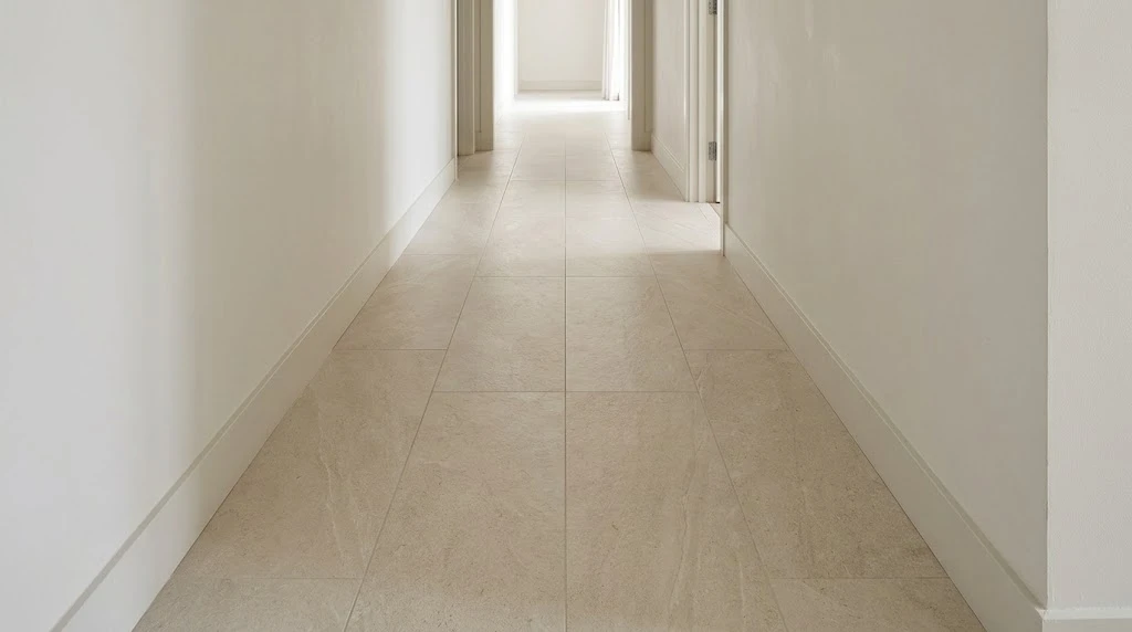
Every house keeps one awkward space somewhere. Perhaps a corridor you can touch across with outstretched fingers. Perhaps a bathroom whose door grazes the basin. Perhaps a kitchen that functions as a passage with a hob in it.
Structural change is beyond most budgets. Yet the way a room reads is still in play, and the ground you walk on is the strongest lever available. Large format tiles shift registered proportion in a way that paint and mirrors cannot replicate. They change what your eye measures, not what your tape does.
Knowing how that happens helps you aim it properly. Here is the mechanism, the rooms that reward it, and the situations that undo it.
Cutting Down the Visual Clutter
Standard tiles are small. Twelve-inch squares are common, and smaller ones exist. Spread across a floor, they weave a net of countless grout lines.
Every line breaks the eye’s journey and forces a fresh start. Across an entire room, those breaks stack up into a stutter. The brain reads stutter as fuss, and fuss as cramped.
Scale reverses the equation. A single 24 by 48 tile absorbs the footprint of eight old 12-inch squares, taking their seams with it. Fewer joints mean the gaze covers more ground before it catches, and the room feels larger before anyone measures it.
Two refinements tighten the effect. Rectified tiles, cut to exact dimensions, permit joints as narrow as 1/16 of an inch. Standard tiles demand wider gaps to disguise variation.
Match the grout to the tile and the surface stops looking assembled. It reads instead as a single field. That is the shift you are paying for.
Running Lines to Bend Perception
Rectangular pieces offer a second trick, and it is free. Point the long edge down a narrow corridor and the corridor stretches. Parallel lines aim the eye at the vanishing point and lengthen the journey.
In a room that is wide but shallow, rotate the same pieces onto the short axis. The flanking walls appear to drift outward. Nothing structural happened; only the reading changed.
Diagonals deserve a mention. They cut across a cramped square and relieve the boxed-in sensation. Additional cuts and higher waste accompany them, so weigh the benefit case by case.
Layout rhythm matters as well. With big rectangles, a straight stack tends to look calmer than offset rows. Staggered joints on a wide piece can come across as sloppy rather than designed.
Set a matched grout over a stacked grid and the whole plane reads clean. At a ceramic tile shop, ask to see both layouts mocked up on the floor. The contrast between them shows up in seconds.
Lifting the Ceiling Without Touching It
Low head height is its own headache, and the remedy runs upward. Continue the floor material up the wall in an unbroken line and the eye climbs with it. Full-height tiled showers rely on exactly this reading.
Large slab panels magnify the trick. Two or three panels across a shower wall, with tight joints and flowing veining, evoke quarried stone. The eye sees a mass, not a stack of parts.
Shower floors remain the exception. Pans slope toward the drain, and rigid pieces cannot bend to follow. Small tiles or mosaics carry those surfaces instead, even in rooms wrapped in slabs.
Joining Rooms at the Floor
Adjoining rooms and open plans benefit from continuity rather than contrast. Run one surface from the hall through the kitchen and into the living zone without threshold breaks. Boundaries that said “different room” simply fall away.
The same logic cures bottlenecks. A tight hall feeding a generous room stops reading as a pinch when the floor never changes. With no seam to mark the transition, the eye carries straight through.
Planning the run across doorways pays off more than most owners expect. Quiet joints at each threshold keep the illusion unbroken. The result is a plan that feels larger than its square footage suggests.
When the Illusion Turns on You
Oversized material is not a cure for every room. Scale must answer to the enclosure.
Set a five-by-ten-foot slab in a powder room and the piece dominates the scene. What you get is one whole tile surrounded by awkward slivers. The room ends up resembling a sample board.
Small bathrooms generally suit the 12 by 24 to 24 by 48 band. The surface should read as fabric of the building, not as sculpture. Pattern strength follows the same logic, since bold veining at slab scale can overwhelm a compact space.
Quiet finishes and lighter tones help tight rooms more than drama does. And one practical caveat: fewer joints means less grip underfoot. Polished porcelain in a wet bathroom is a genuine hazard, so favour a matte finish with a proper slip rating.
Loose samples make the test straightforward. Collect a few from any ceramic tile shop and set them in the room you are treating. Judgement follows quickly once you see the pieces at full scale.
The Setting You Have to Pay For
Installation is where design essays often fall silent. Bigger pieces are heavier, slower, and more demanding to place.
Flatness of the substrate becomes critical. Industry standards ask for a floor level within about 1/8 of an inch over ten feet for large formats. Many older floors fall short, and correcting them with compound or grinding adds real cost.
Lippage is the other hazard. An edge standing proud of its neighbour is both seen and felt. Leveling clip systems keep edges flush but add materials and hours to the job.
Handling itself carries risk. Large pieces are awkward to carry and need big cutters or wet saws. Breakage rises with size. Price the work accordingly.
Experience counts double here. Ask your setter when they last laid 24 by 48 and note the reply. Staff at a ceramic tile shop often know which local crews handle oversized work regularly.
Test Before You Decide
Photographs mislead. Scale, hue, and finish all shift on screen, and none of them survive translation. Seeing the material is the only reliable test.
Request full pieces rather than small display squares, and bring one home. Place it on your floor in your actual daylight. A tile that glowed warm under showroom LEDs may turn flat gray by a north window.
A second check costs only painter’s tape. Mark the tile dimensions on your floor and step back. The taped grid in a five-foot corridor tells you at once whether the proportion works.
Speak with your installer before ordering as well. They will report what the subfloor accepts and what the pattern costs in cuts. Ten minutes of hands-on evaluation beats a long evening of browsing galleries.
What It Comes Down To
Room dimensions are stubborn facts. Perception of those dimensions is far more negotiable.
The method works by editing visual noise. Fewer joints, longer sightlines, cleaner planes. Aim the layout, choose the size honestly, and prepare the floor properly for the effect to hold.
That is the trick at its simplest, and it costs far less than moving walls. Measure the room, tape the grid, and match the format to the proportions you have. The room will not enlarge. It will merely stop broadcasting how small it is.
Comments
No comments yet. Be the first to react!